Terms of your trip
Count of travellers
0-70 years
2
+
Date of travel
from 05/04/2024 to 06/23/2024
Country of travel
Select one or more countries
Health insurance
#135689
Valid till 4/5/2025
Preliminary conclusion
Provided by

Moderate condition
Based on your symptoms, we recommend that you do not delay making an appointment with the doctor.
Recommendations
General practitioner appt.
Online consultation is available
Possible diagnoses
Acute pharyngitis
SARS
Selected symptoms
Chills
Headache
Dry cough
High temperature
Severe sweating
Fever
Nausea
Edit
Next
9:41

Login / Registration
Terms and conditions

Clinics and hospitals
Shop for recommended medical supplies in your locality. Book a doctor appointment at three clicks.

9:41


PROJECT PROBLEM STATEMENT
‘we have 3.9 ⭐️ in AppStore
and we don’t understand, why’
This is the exact request company leadership stated in meeting of 30 people, including me. It was my first time working with Ukrainian product company.
Customers overloaded hotline, causing delays in service primarily because the mobile app for booking appointments wasn’t usable.
Drag a handle to see both versions
BREAKDOWN
2 core user flows done
Outdated registration and complex forms - no wonder they've got 3.9 ⭐️ reviews.


PROBLEM STATEMENT
A seamless flow for new and recurring users
A key challenge with registration in mobile app was outdated UI look with input fields and texts that wasn’t passing threshold of accessibility, with complex steps that included filling personal sensitive info.
How could we reduce friction and cognitive load in the registration process?
🌈 Customer hope
Learn about insurance services, and file an insurance request.
🚧 Barrier
Request of sensitive data on early stage of exploring the app.
💀 Pain
Manual email and password creation, outdated look.


FEATURES
Asking only what is needed
We redesigned the process to request sensitive information only when it was absolutely required, such as during the purchase of an insurance policy. By splitting the form into steps and applying progressive disclosure, we reduced cognitive load and ensured a smoother experience for all users.

FEATURES
Login via phone / email
Now existing customers is mapped via phone number or email combined with date of birth, eliminating the need for redundant input. For returning users, we introduced biometric login.
FEATURES
Larger headlines and inputs
The registration UI was updated with large, bold inputs and text, adhering to AA standards for the majority and AAA standards for the 5% of users over 55. By splitting the form into steps and applying progressive disclosure, we reduced cognitive load and ensured a smoother experience for all users.
FEATURES
Secure access
.Using only a phone number and date of birth for authentication was deemed insufficiently secure, raising concerns about data protection. Inspired by Monobank, we introduced a PIN code system to enhance security while leveraging existing user data.
USER TESTING
Adding security layers
Once the new experience was ready, we reached out to UNIQA mobile users for User Testing sessions.
We asked them to try out the new experience, and we achieved incredibly useful feedback, they moved
through the registration with the lightbolt speed and get to the insurance policies, and had almost
no hiccups along the way.

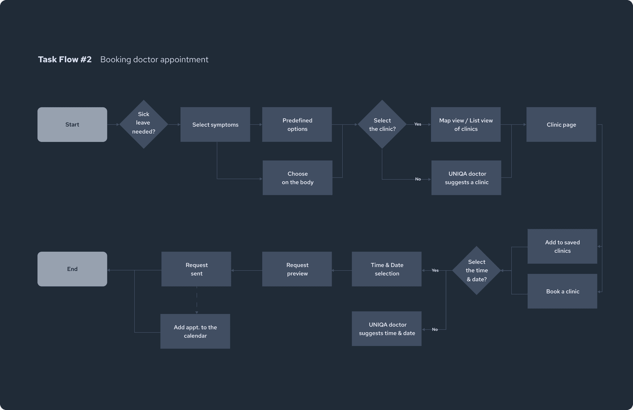
PROBLEM STATEMENT
Increasing usability of doctor appointment form
A bunch of freeform fields, lack of optimization for accessibility and tiring date and time selection - those were top 3 problems mentioned in reviews in AppStore and GooglePlay Market around doctor appointment booking flow in the mobile app.
How could we simplify the form in the doctor appointment submission?
🌈 Customer hope
Book a doctor appointment
without long waits on the hotline
🚧 Barrier
Complex form with 12+ fields and difficult to use UX patterns.
💀 Pain
No way to receive an insurance response directly in the app.
Drag a handle to see both versions


FEATURES
Secure access
Ideating on the particular flow, we researched various options to make the symptoms selection easier. First of all we contacted the team of health insurance, and they suggested ti leverage information from DMS-5 with all criteria's that usually doctors specify for diagnosis. It would require us to build a back end (that Uniqa didn’t have) to maintain all symptoms and tie them to particular request and users. Researching more we have found more easy third party solution called Symptomate. We spotted that it’s a good decision from business perspective to have this type of integration rather than build and maintain backed ourselves. + Symptomate was able to provide additional value for clients of showcasing pre-diagnosis to show what is going on with them.
FEATURES
Secure access
We decided to move functionality of search for clicic for a new app version for non-clients of UNIQA to let them explore potential benefits of the app + let them be able to sign for telemedicine consultations.
USER TESTING
Adding security layers
Once the new experience was ready, we reached out to UNIQA mobile users for User Testing sessions.
We asked them to try out the new experience, and we achieved incredibly useful feedback, they moved
through the registration with the lightbolt speed and get to the insurance policies, and had almost
no hiccups along the way.
CLIENT TESTIMONIAL
From UX analysis to ideation : what a journey!
Elena Markova
Board member
We were impressed by the depth of the UX analysis of our customer's research, buyer persona creation, user journey mapping, etc. All the information like research findings, for instance, was presented in a clear form (presentations, Miro boards, clear infographics) so it was quite easy to understand what we need to build and why.
REFLECTION
Key lessons for startup owners and enterprises 📕
Build with scale in mind
Make sure your app architecture
can support adding more features
in a logical, ease to navigate way.
Focus on conversions
Simplifying key flows like onboarding
has a direct impact on your revenue. Easier flow = higher retention.
Simplify the language
A conversational tone significantly improves engagement. People buy
from people, and they sense formality.
RESULT
From 3.9 ⭐️ to 4.9 ⭐️ within the first month
22% increase of customer satisfaction
InUMUX-Lite survey, users reported that the app feels friendlier to navigate.
4.9 ⭐️ in the AppStore
First users highlighted that a new version of the app feels much more easy to use.